TurboTax.ca Global Notifications Framework
Intuit Internship Project | Toronto, Canada (Remote)
Designing a framework that provides guidance on handling requests for site-wide TurboTax messaging and notification banners.
|
MY ROLE
Product design intern
TurboTax CG Design |
TIMELINE
2 months
(out of my 4 month internship!) |
TEAMMATES
|
DESIGN TEAM & OVERVIEW
During my virtual 4-month design internship at Intuit, I was a part of the TurboTax Consumer Group (CG) team, specifically on the front-doors design team. Simply put, front-doors is the entrance or 'front' of our online tax store (ie. website). For one month of my internship, I took on a global notifications framework design-ops project for the TurboTax.ca website, with my main role during this project being product strategy, design-ops and visual design. I was one of two product designers on this project, with the other designer focusing on the final visual and interaction design, ensuring component-level consistency.
Context: Existing TurboTax.ca Notifications
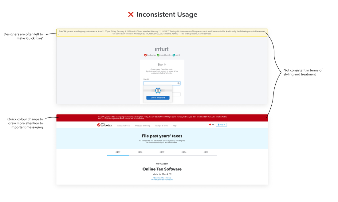
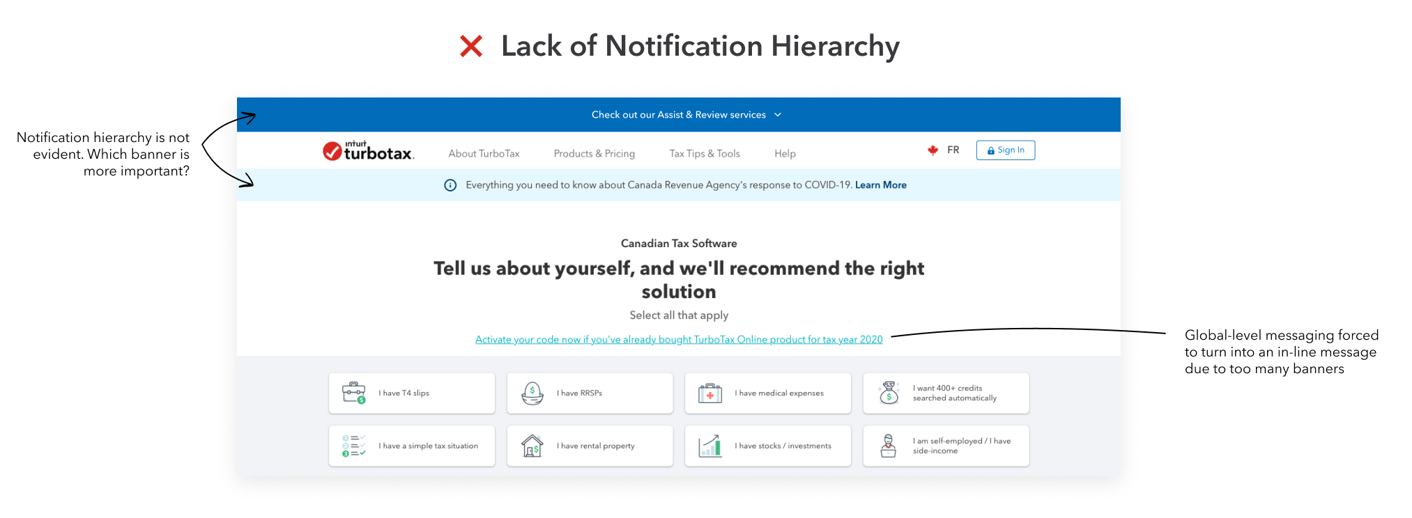
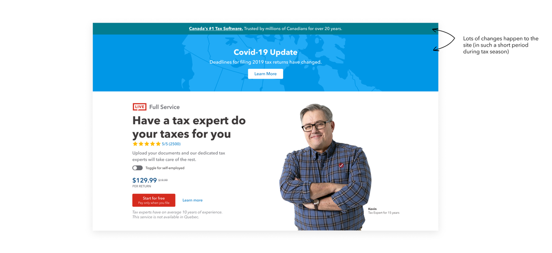
It was found that the various messaging that exists across TurboTax.ca was not consistent in terms of styling and treatment, often leaving TurboTax designers to make 'quick' fixes. Overtime, these quick 'band-aid' fixes began adding up with multiple instances where disruptor components showed no hierarchy or consistency. Therefore, it was decided that the design team needed to rethink and decide on design principles as to how we treat notifications on TurboTax.ca overall.
Framework Requirements
FRAMEWORK GOALS
|
1
Provide a framework for site-wide messages based on urgency, attention and importance.
|
2
Create a visual hierarchy and structure to how notifications are presented consistently on TurboTax.ca.
|
3
Have a holistic view of notifications and plan for common messaging scenarios.
|
PROBLEM STATEMENT
‘As a TurboTax.ca designer, I want to easily determine which notification type and visual treatment to use based on the messaging content, so that notifications are presented consistently and intentionally across TurboTax.ca’
Research: Notifications based on Attention
Notifications range in their priority and therefore should vary in their disruptiveness to users. This framework utilizes content based decisions in order to determine the treatment of the notification for various types of communication between users and TurboTax.ca. This is done through an importance / urgency matrix.
A attention = (U urgency) x (I importance)
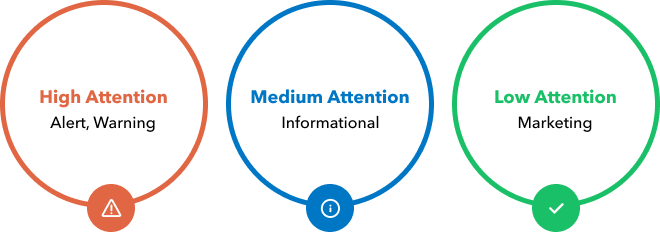
ATTENTION ('LEVELS OF SEVERITY')
Attention is a function of importance and urgency, and is categorized into high, medium and low attention levels. Therefore, attention is determined by the information’s impact on the user experience and the degree of action as a result of the information.
- Urgency - Urgency defines the degree of action of the user based on the messaging.
- Importance - Importance is the effect the messaging has on the customer experience.
The Framework: Global Disruptor Banner
USAGE
The global disruptor banner is a system level notification that takes over the top of the site interface, below then navigation, to show general notifications for the product or system. Banners can include a ghost button or link. Global banners persist across the entire site, while page-level banners may exist on specific pages.
|
BEST PRACTICES
|
VISUAL ANATOMY
|
1. Icon: Informs users of the kind of notification at a glance.
|
2. Message: Provides detail and actionable steps for the user to take.
|
3. Notification action (optional):
|
DESIGN SPECS
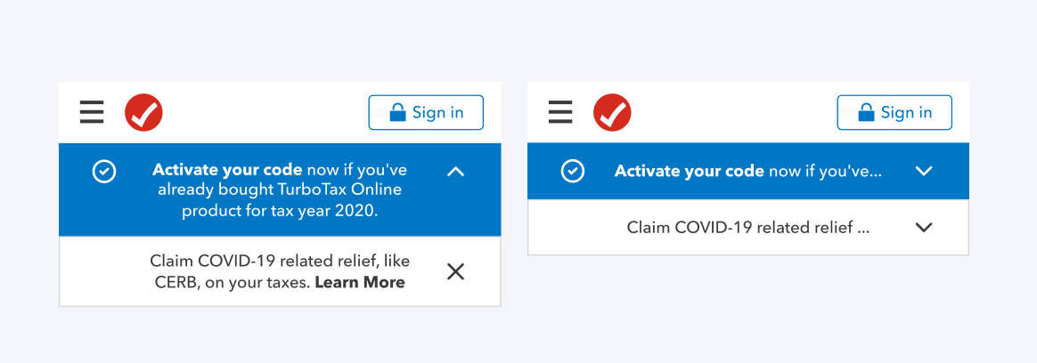
Design Specs - Desktop
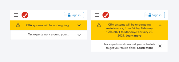
Design Specs - Mobile
The Framework: Designing Attention-based Global Disruptors
Based on different types of messaging that could appear on TurboTax.ca, the goal of these attention-based disruptors is to understand the visual hierarchy of notifications and to utilize that hierarchy to communicate urgency and attention.
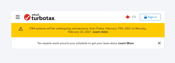
1. High Attention Disruptor - Alerts, Warnings
Use high attention disruptors for alerts and warnings of highest importance, for example when something critical has happened and requires immediate attention. Use a high attention disruptor for messages such as:
- Alerts (potentially hazardous situation, when the system fails to perform an action)
- Warnings (possible or impending problem, or other unpleasant situation)
- Exceptions (system anomalies, something didn’t work)
- Confirmations (potentially destructive actions that need user confirmation to proceed)
The High-Attention Disruptor in context:
|
|
|
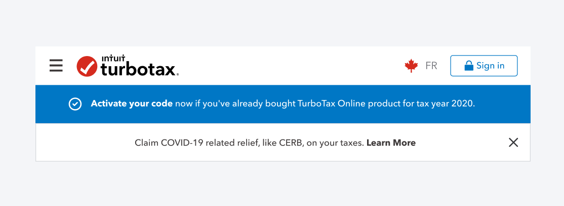
2. Medium Attention Disruptor - Informative
Use medium attention disruptors for messages that do not require immediate attention but are important for the user to know. Style the informative disruptor with a blue-02 style. Use a medium attention disruptor for messages such as:
- Informing users about changes and updates
- Acknowledgments (feedback on user actions)
- Informational messages (aka passive notifications, something is ready to view, activate)
Medium Attention Disruptor in context:
|
|
|
3. Low Attention Disruptor - Marketing
Use the low attention disruptor for passive messaging and marketing-type content. The low attention disruptor can be dismissed as the messaging is of lowest importance in comparison to medium, high attention disruptors. Use a low attention disruptor for messages such as:
- Marketing promo for information found on blog posts
- Promotions for specific marketing campaigns and/or products
Low Attention Disruptor in context
|
|
|
Disruptors in Context
When combining varying levels of global disruptors, principles were developed around how disruptors can exist on a page in combination. As mentioned in the 'Best Practices' section, only two global disruptors can exist at most at a time. For example, a medium and low attention disruptor with the higher-priority disruptor on top. This allows the notifications to live hierarchically on a page and simplifies the user experience by showing natural relationships between items with visual & content hierarchy.
Medium Attention + Low Attention Disruptor
High Attention + Low Attention Disruptor
Conclusion
FUTURE CONSIDERATIONS
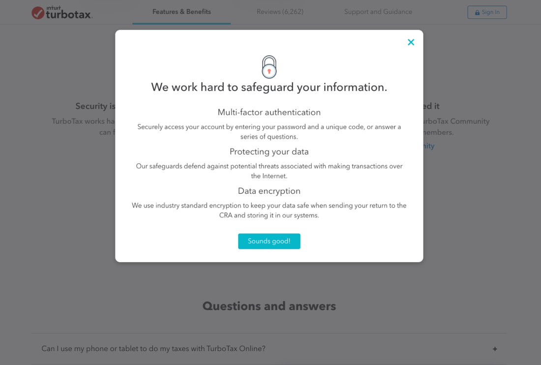
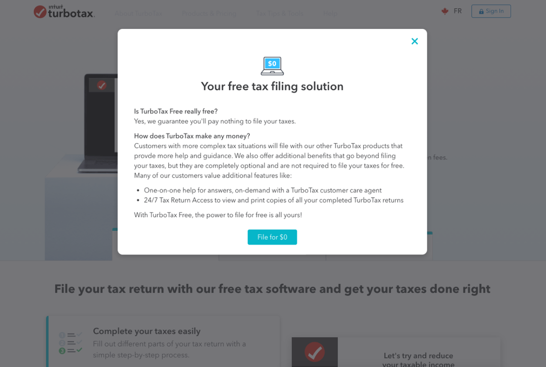
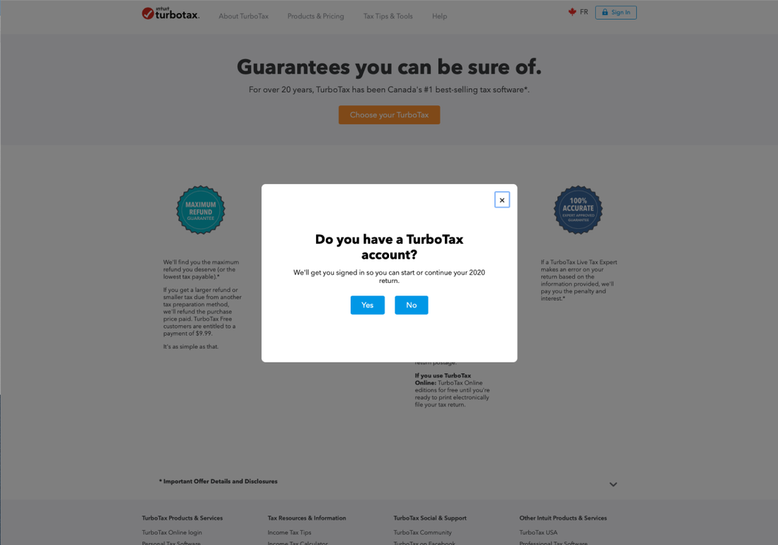
Popup modals and inline messages also exist on the TurboTax.ca site, therefore the principles from this notifications framework can be applied to other components as well. The Urgency / Importance matrix can also be applied to make attention-based design decisions throughout the TurboTax site, for example for content design principles or marketing content.
KEY TAKEAWAYS
Limitations to the framework
Based on feedback from my design team, I learned that knowledge of the business case is also a big factor in making design decisions relating to global messaging. For example, styling for specific product lines have a set of design guidelines (ex. TurboTax Assist & Review uses Navy-02 and TurboTax Full Service uses Red-01). Therefore, there are edge-case notifications that cannot be classified automatically. In these cases, this framework serves as a recommendation for notification treatment and as a set of heuristics to make more efficient design decisions.
Using guidelines to create guidelines
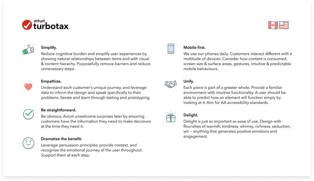
As a part of the TurboTax front-doors design team, we follow a set of TurboTax design guidelines and principles on the high-level as well. Therefore, from using these higher-level design principles to create component-level principles, I learned to have a good sense of the overarching product strategy and to always keep principles in mind, as they should always apply regardless of designing for output (webpages and apps) or for design operations (ie. this framework).

