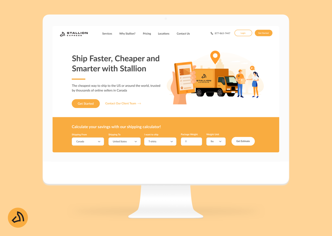
Stallion Website Redesign
Outgive Internship Project | Toronto, Canada
Redesigning and testing the Stallion Express website, in order to optimize conversion rate and create a positive user journey.
|
MY ROLE
UI/UX, front-end development, user research, A/B testing
|
TIMELINE
3 weeks
May 2020 Remote |
TEAMMATES
|
OVERVIEW
During my internship at Outgive, I took on the website re-design of Stallion Express, one of Outgive's brands. My role during this re-design was to modernize the overall UX of the website, as well as create a positive user journey that aligns with their existing marketing strategy. I was one of two front-end developers on this project, the other being a lead developer. On top of the development team, my team for this project included product managers, marketing specialists, content writers and graphic designers.
View the live website here!
About Stallion Express
Stallion Express is Canada's #1 eCommerce shipping solution, specializing in shipping and logistics solutions for online sellers, including Amazon, Shopify, Etsy, and eBay. Over 5000+ businesses over Canada have streamlined their shipping process with Stallion Express and have saved $2,000,000 in shipping costs for over 3 million parcels.
Phase 1: Define & Empathize
PROBLEM STATEMENT
“How might we make the Stallion Express website more engaging for current users and easier to navigate?”
WHY A RE-DESIGN?
Not Addressing Customer Needs
Since its establishment in 2015, the online presence of Stallion Express has therefore grown to over 7000+ site visits per day, a consequence, the website content became outdated and didn’t reflect the company anymore. This site was no longer a profit centre, and didn’t quickly address customer needs.
Difficult to Understand
When users went to the website to get help or gain a better understanding of the company, the sparse information and long paragraphs of text made it difficult to understand exactly what each service was. As a result, conversion rates were suffering, ultimately hurting the company's bottom line.
Outdated Content
In the competitive world of eCommerce and shipping services, it's fast delivery times and reliability, along with excellent customer service that sets Stallion Express apart. The existing outdated and difficult-to-use website created a disconnect in our marketing and conversion rates, so a redesign was fitting.
SOLUTION STATEMENT
“Streamline the website to raise awareness of the Stallion Express brand, services, and advantage, while converting customers through a positive user experience.”
USER TYPES
In order to deliver a high quality site, my team identified 2 user types to consider, and delivering to the following user groups would allow me to design a website that successfully met our needs.
COMPETITIVE ANALYSIS
To gain inspiration and identify best practices for our website redesign, I conducted a competitor analysis. I began by looking at the websites of several other Canadian shipping companies and services including Chit Chats, Shipstation, eShipper, and Canada Post.
Three Step Tagline
Another common design pattern I observed was that each company prominently displayed a short, catchy three word shipping tagline at the beginning of their homepage. For example, ChitChats uses "Sell. Ship. Save" and Shipstation uses a three sentence tagline "Wherever you sell. However you ship. Exceptionally efficient." This was an important method to effectively communicate each company's mission to sellers.
Another common design pattern I observed was that each company prominently displayed a short, catchy three word shipping tagline at the beginning of their homepage. For example, ChitChats uses "Sell. Ship. Save" and Shipstation uses a three sentence tagline "Wherever you sell. However you ship. Exceptionally efficient." This was an important method to effectively communicate each company's mission to sellers.
Phase 2: Ideation & Wireframing
INFORMATION ARCHITECTURE
I used a user-centric approach to defining and testing the IA for the reimagined Stallion Express website. I started by mapping out user navigation through a user flow diagram, then sketching how functionality would work with each of the pages. I created the IA using a card sort method where I re-grouped the current website IA and make it more cohesive, which was key to forming the new navigation.
During the ideation process, the site architecture was also constantly changing, which meant I had to adapt frequently to quick changes. Pages were being merged, added, and deleted, as I helped my team think critically about customer pain points and the user journey though the website.
During the ideation process, the site architecture was also constantly changing, which meant I had to adapt frequently to quick changes. Pages were being merged, added, and deleted, as I helped my team think critically about customer pain points and the user journey though the website.
WIREFRAMING
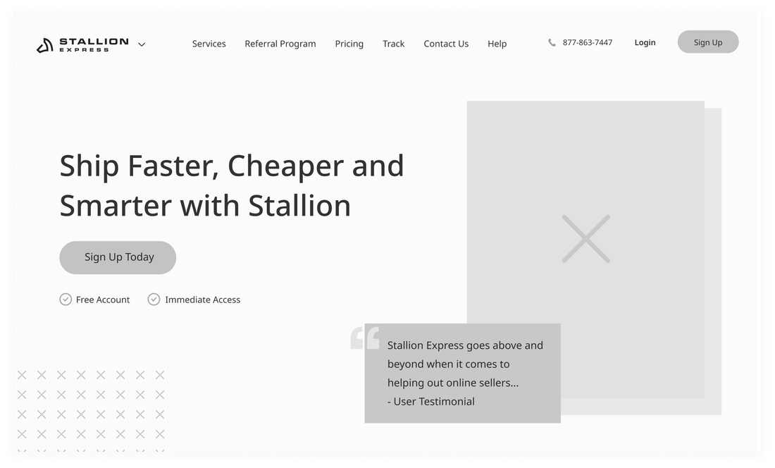
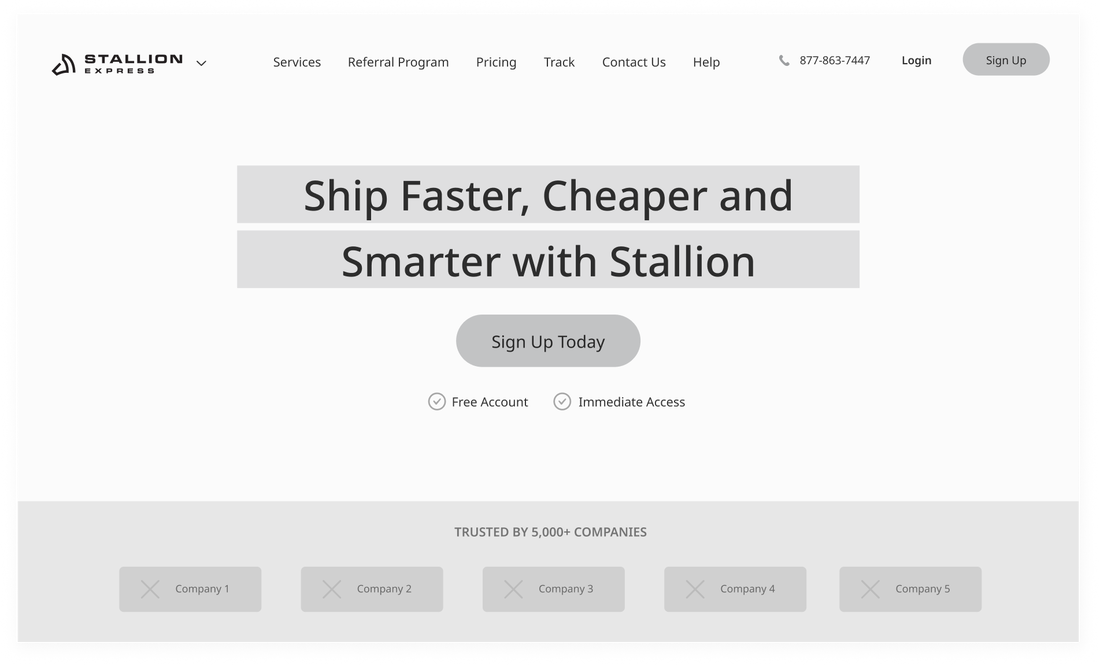
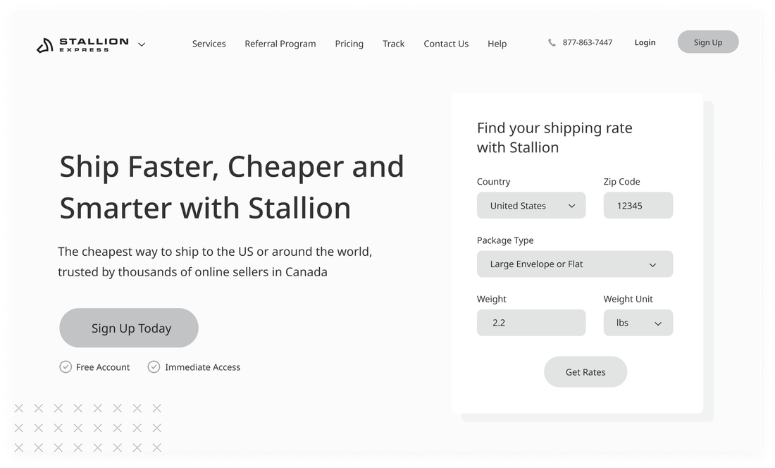
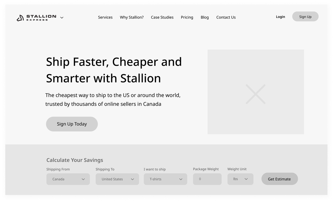
After my team defined the core pages and functionalities that needed to be included in our new site, I created quick, low-fidelity wireframes. I experimented with various layouts, which allowed me to consider various structural layouts and designs before designing the rest of the web pages.
Low-fi Wireframes Iterations
Website Page Low-fi Wireframes
|
|
|
|
|
|
|
|
STYLING & RE-BRANDING
I made styling decisions to reflect the new brand as I was tasked to create a design system based on our new logo and colour palette. For the colours, I wanted to achieve a feeling of trustworthiness, but also wanted the website to feel organized and have that “trendy” factor, hence the primary yellow complemented by the secondary blue and gray colours. For typography, I chose to stick with Lato font in order to reflect the trendy and reliable feeling we wanted to have consistently throughout the brand.
ILLUSTRATIONS
After establishing a design system, I worked with graphic designers to create illustrations for each website page in Adobe Illustrator. Using the wireframes as a reference point for the sizing & layout, my team worked together to create illustrations that reflect our brand as well as a trendy and fun feeling. I also wanted to highlight the iconic yellow Stallion Express colour, as it defined our brand very deeply.
Phase 3: Design
Putting everything together, I began to design each web page in Figma, using the wireframes for layout, the design system for styling, the illustrations for graphics, and copy provided by my team. This part of the process required me to sync with all my team members on a daily basis and provide detailed design updates in order to stay on track and receive feedback.
|
|
|
|
|
|
|
|
|
|
|
|
|
|
|
|
|
|
|
|
|
Phase 4: Test
In order to test the website for the best designs, my team conducting three different A/B tests after launching the website. Based on conversion rates or other metrics, A/B testing allowed my team to decide which designs perform best. As our users evolve and the Stallion Express business grows, A/B testing is an ever-evolving process that ultimately had a huge impact on our bottom line.
A/B TESTING TOOLS
- Google Optimize - conduct the A/B test
- Google Analytics - view insights, track metrics
- Mouseflow - for heat maps
METRICS
We will determine the homepage that performs better using the following metrics. These are measured and tracked through Google Analytics.
- Bounce rates
- Engagement metric (Session duration)
- Heat map
- Conversions (sign-ups)
- Pages per session
EXPERIMENT RESULTS
We ran this experiment for 5 days, and had a total of 2,482 experiment sessions. The original design had 1,264 sessions (50%) while the variant had 1,218 sessions (50%), therefore roughly halfway split between the two.
a. Conversions (Sign Ups)
|
Original
|
Variant (WINNER)
|
b. Avg Session Duration
|
Original
|
Variant (WINNER)
|
c. Bounce Rate
|
Original
|
Variant
|
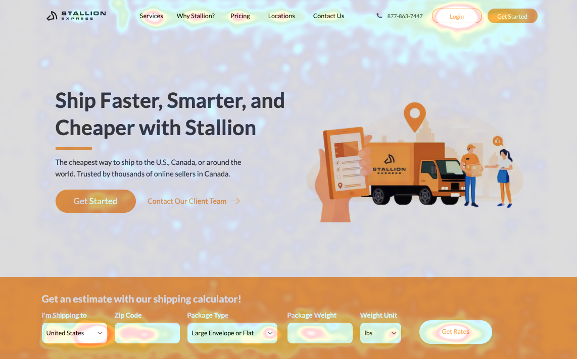
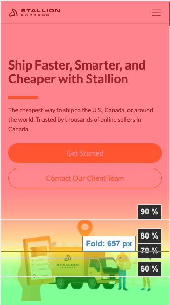
d. Heat Maps
Using Mouseflow, we tracked the user movement of 1,939 users in the span of the 5 day experiment. The heat map provided valuable insight into where users were clicking with each design, how frequently areas of the page were visited, and the scroll behaviour on each page. One of the main insights from our heat maps was that users were attracted to the rate calculator and often used the calculator multiple times in one session.
LANDING PAGE TEST CONCLUSION
Overall, the variant performed better in almost all aspects, including conversions, avg session duration, bounce rate and heat map movement. It was found that users are exploring the website more with the variant design, spending a greater average time with the variant vs the original. As a result of this, users were converting more with the variant design, meaning more sign ups and logins. Stallion Express is now better serving customers, and converting users through this redesign.
Reflection
This project was an amazing learning experience for me in so many ways. Overall, our team accomplished an incredible amount of work considering our relatively short timeline of 3 weeks. I personally learned a lot about the process, collaboration, and working with my diverse team.
KEY TAKEAWAYS
Importance of CRO in UI Design
One thing that I found especially impactful was learning about conversion rate optimization in UI design. In the past, I've typically worked with specifically design & development teams, therefore this was my first time working with marketing, growth specialists, content writers, and sales. This project has allowed me to develop new web optimization skills that will be helpful for other projects in the future.
The Importance of Testing
Compared to previous projects, this project was very heavy on testing, especially A/B testing. I saw this as an opportunity to strengthen my user testing skills and get more involved in the process of learning about users and how they interact with various designs.


